Bug Identifier: UI/UX Case Study
Focus: Mobile Utility & Mapping Integration
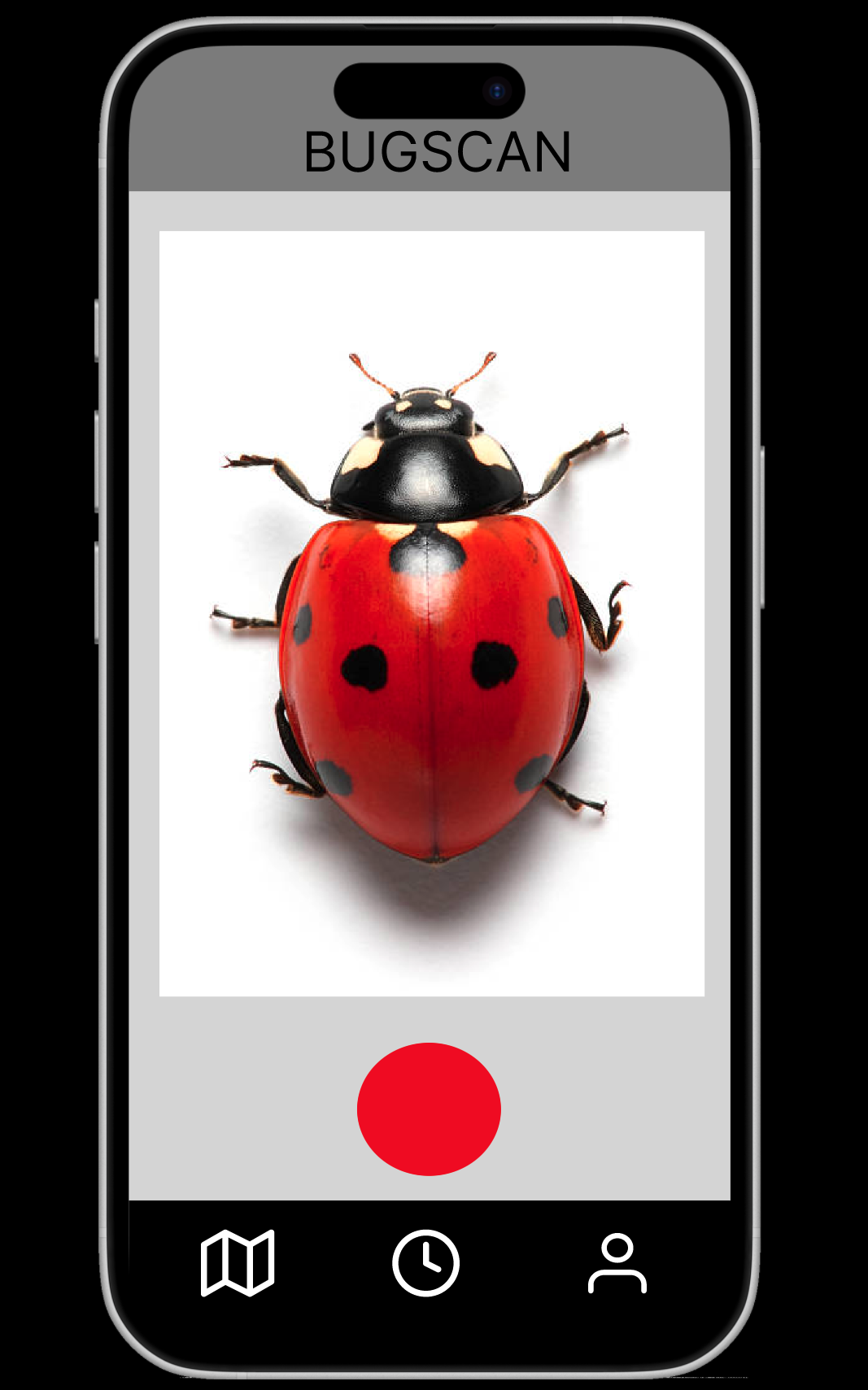
I developed a mobile application designed to help users instantly scan and identify insects while mapping their locations for community discovery.
The Problem
Existing identification tools often frustrate users due to several key UX failures:
- Low Visibility: Visual designs fail to stand out or feel modern.
- Artificial Limitations: Many "free" apps have hidden usage caps that annoy users.
- Confusing Interfaces: Cluttered dashboards make it difficult for consumers to navigate quickly in the field.
The Solution
I focused on a "Scan-and-Go" philosophy to make the app accessible for everyone from students to hikers:
Research & Benchmarking
Through Competitive Benchmarking, I found that high-standard utility apps often fail by being too feature-heavy. My analysis showed that users are overwhelmed when too many things happen at once. My design simplifies this by focusing on the three core needs: Identify, Map, and Learn.
Conclusion
This project reinforced that UI/UX is about functional problem-solving. A clean design doesn't just look better—it builds the trust and efficiency necessary for a utility app to succeed.
"UI/UX isn't just about aesthetics; it's about solving the functional problems of accessibility and speed."