Lipton Tea: Home Page Redesign
Focus: Visual Hierarchy & Modern Typography
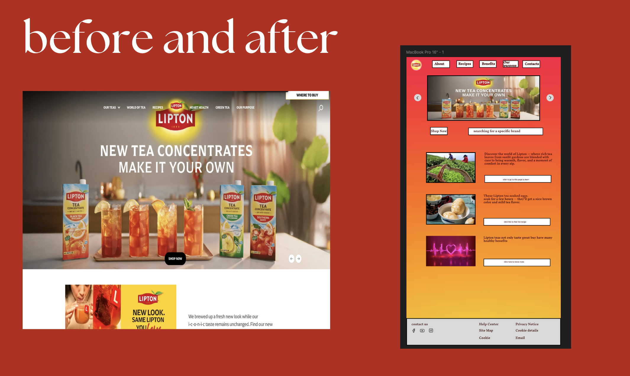
I redesigned the Lipton Tea digital experience to improve navigation flow and brand authority through cleaner typography.
The Problem
The website suffered from a dated aesthetic and inconsistent visual design, leading to several UX friction points:
- Weak Visual Hierarchy: Users struggled to prioritize information.
- Navigation Clutter: The search bar was poorly aligned with the nav menu.
- Accessibility Issues: Text over images made content nearly impossible to read.
This lack of professionalism eroded brand trust and diminished user confidence.
The Solution
Research & Benchmarking
I performed a focused Competitive Benchmarking analysis against TAZO. While Lipton felt crowded, TAZO provided a clean, modern standard with a simplified layout. This proved that a tea brand can achieve visual clarity without losing its identity.
Explore the full interactive process:
View Figma PrototypeConclusion
By implementing a modern aesthetic and simple structure, I addressed visual clutter and reinforced brand trust. The final result is highly scannable and accessible.
"My biggest takeaway was that visual hierarchy isn't just about looking good—it's about solving functional problems."