Article Case study (Yale School of art)
I worked on making a website for Yale school of art. The main goal is to make some of there pages look better and less confusing for the audience.
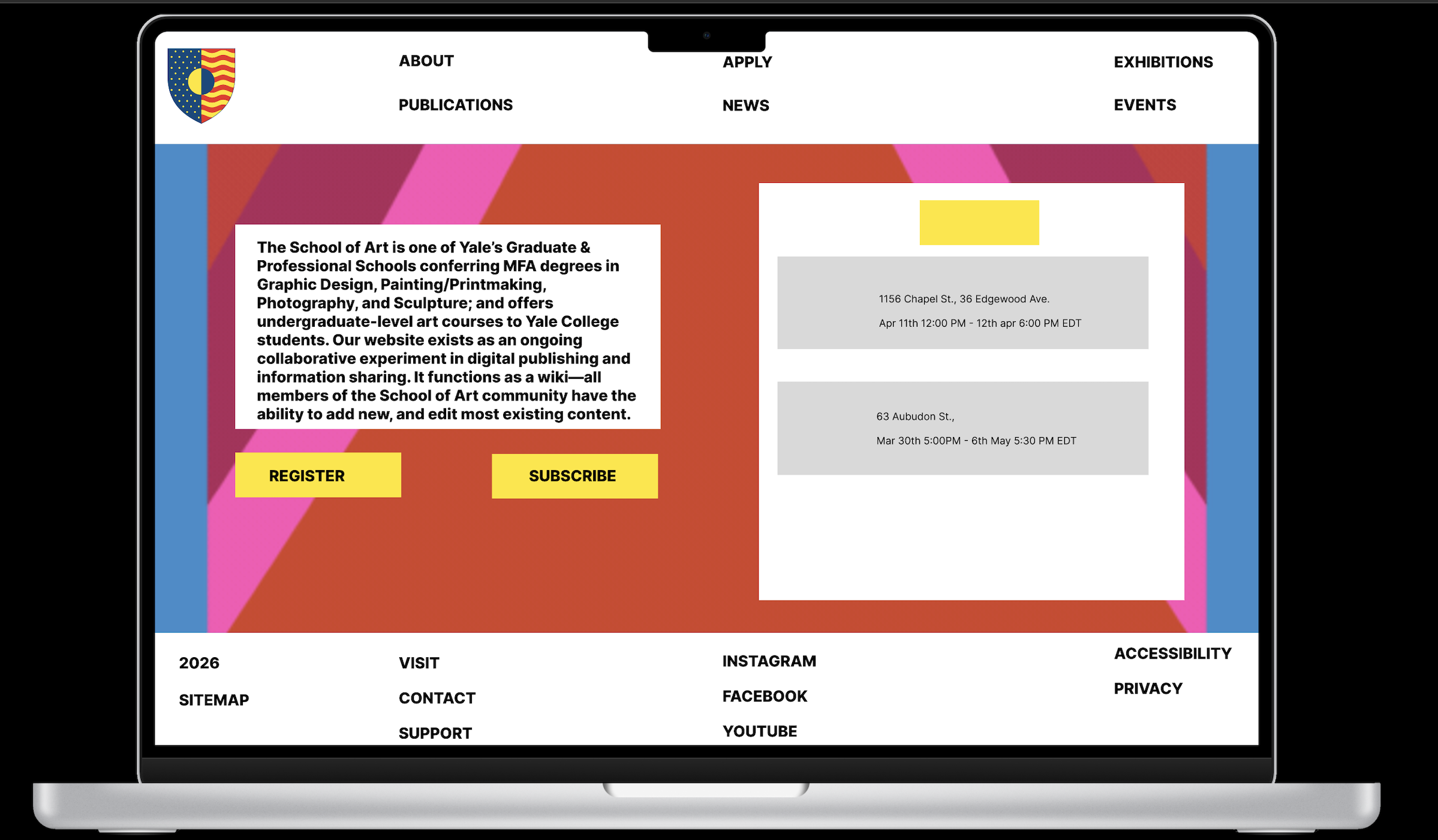
The Problem
There are many problems with making this website:
- Does not stand out: The current design fails to make a unique impression.
- Too Cluttered: The interface is so busy that it makes the website look disorganized.
- Visual Conflict: The background and words clash with one another, hurting readability.
This a major problem—its an art school and it makes the school look bad.
The Solution
- Make the colours work together when doing the pages.
- Make it less busy and add a good use of white space.
- Ensure the background works together with the words for better legibility.
Research Discoveries
To formally justify the need for a redesign, I performed a focused Competitive Benchmarking analysis. When comparing my improved website to the official site, it looks better as it improved on all the interface and problems.
Conclusion
This project reinforced that UI/UX is not just about aesthetics; it is about functional problem-solving. A clean design doesn't just look better—it makes content scannable and builds the trust necessary for a successful online business.